Yes, finally we come to the end of the module. I would like to say that the module is fun. Got many 1st times in this module:
1. First time drawing so many things on sketch book.
2. First time designing a notebook cover.
3. First time producing a storybook (although its a kids one)
4. First time keeping a portfolio (in Art).
5. First time spending so much money in a module (about $80 total to date)
6. First time buying so many pencils of various hardness
I still remember Dr Julian showing us a slide on what students say at week 13. Well, I would have to repeat some of the statements because I agree to what they say.
1. This module require good drawing skills - agree because without drawing you can't produce anything or design. That's the fundamentals of design - basic drawing.
2. This module requires some level of creativity - if you don't have drawing skills, some creativity might help by using basic elements to bring out meaning.
3. Basic level of photoshop skills is required too - no photoshop no design. Most of the assignments need photoshop.
4. Good grasp of concepts that is taught in class, although some are already in built in us or learnt outside of the course. - Concepts are applied in designs and analysis.
I must say this module really improves my skills on photoshop/illustrator as well as imagination and visualization of a design concept. I loves filming and photography myself, which is communication using visuals (hence visual comms) It definitely benefit me in my hobby. From basic visual representation to color representation, all these are essential in filming and photography. I would definitely apply these in my future film productions.
I learnt about my weakness in visual communications and that is color. I feel that I am particularly weak in visualizing and imagining color. As a result, I always use bad color combinations. However, learning the different color schemes and meanings, I would apply them (blindly but appropriately).
Finally, I would like to thank Dr Julian and Mr. Reddy for all the guidances and fun in class. Hopefully we would meet again either in your future class or in work. See ya!
Monday, November 19, 2007
Project! - Finally!
After a series of discussion and consultation, my group has decided to choose "Jimmy's Fantastic Adventures" for our storybook. Most of the thought process of selection of story, layout and font, etc are documented in the design document which is accessible here:
Design Document
http://www.comp.nus.edu.sg/~fengjia1/Design_Document.doc
Storybook
http://www.comp.nus.edu.sg/~fengjia1/StoryBook.pdf
Our group's work is divided into and handled this way:
1. Drawing - Wei Man
2. Coloring and Printing - Serena
3. Font, layout and grid (Design specification and document) - Jianda and Gerald.
I have no choice but to comment on the work distribution efficiency as to warn others not to do this in future. I feel that our group's work distribution isn't the best.
Since everything is already done and submitted, it is too late already. However, it is good to do self-reflection:
I personally feel that each and everyone of us should do a character or background, inclusive of drawing and coloring. Font,layout and grid selection should be done at meet up to have a common agreement on the appropriateness of it. Our way of job distribution causes some pictures undrawn due to time constrain and pictures uncolored. Due to the late production of pictures, the layout and grid also came late (although font is easily selected and done). Lesson is learnt. :)
I am left with not much time for other exams. I'll just have a last post on my final words and conclusion.
Assignment 6b - Analysing a website design
I've been given 5 designs of which I need to criticize and improve on 1 bad design
http://mum.edu/ - Maharishi University of Management
http://www.meca.edu/ - Maine College of Art
http://www.malone.edu/ - Malone College
http://www.manchester.edu/ - Manchester College
http://www.mancol.edu/ - Manhattan College
I've chosen Manhattan College as the one on bad design. I've included all the analysis thoughts in the Word and Powerpoint file.
http://www.comp.nus.edu.sg/~fengjia1/6b.ppt
http://www.comp.nus.edu.sg/~fengjia1/6b.doc
Assignment 6a - Dissecting a poster design
I've chosen 2 posters to comment on. 1 is the MOE career advertisement while the other is for the movie "Rails & Ties". 

The Bad Design

The Good Design

The Good Design
I've included my thought process in the powerpoint file. It is a comprehensive step by step explanation. Refer to the Notes Page at the bottom of the slide. You may access it here:
Assignment 5 - Major Overhaul
I made a major overhaul with assignment 5 because I feel that the design seriously lacked color. The original design was "World Peace". The feedback gotten in class was that "World Peace" does not appeal to a lot of people because they know there is such thing but no one cares. I also had a design titled "Antarctica" but the color was too plain as well. Reddy said I had to imagine something and get interested in it in order to give it more color.
I've finalized the design into "Antarctica - perception".


It shows a family of 3 penguins looking at the falling (or melting) glacier. In our perception, we know something is very wrong. The earth is warming, causing glaciers to melt. However, in the penguin's perception, they may thought about some other things. To make it comical, they are probability thinking that a giant fish had emerged within and there would be a big meal soon. We wouldn't know what they're thinking when they see melting glaciers and they wouldn't know that their homeland is shrinking due to melting glaciers. Thats the kind of contrast I wanna bring out in this design. The inner design has to be simple because a person using notebook probably wouldn't want to get distracted by it. So I just put the 3 penguins in and looking at each other.
Assignment 4 - Total revamp
My assignment 4 is totally different from what I presented in class. I presented "Stop Nuclear Arms" poster in class. The feedback received was not very good and I had to totally scrapped the design. Reddy said the idea "Stop Nuclear Arms" does not have a wide audience and only a few Nations are involved.


My new idea sort of reaches out a wider range of audiences. I reused some of the color scheme (fiery, hot, warm) for the poster as the title is "Stop Global Warming". My concept is using a sunflower "watering" the heated earth. I purposely made the sun bright and glaring with a orange tint on the earth's surface to signify the "warmth" that it is feeling right now. Furthermore, the message I am trying to bring out is that, we can't rely on plants to keep our earth cool (by recycling the carbon dioxide in the atmosphere). We, humans, would have to do our part in stopping global warming. The list of steps is written in the text. The last phrase "Plants have done their best..." means that the plants have already done what they can to keep the earth cool, it is us that worsen the situation... (by burning more fuels, wasting energy resource, destroying vegetation, etc).
Assignment 2 - touchup
I touch up a bit of the assignment


I only widen the gap of the lips to make it look more like lips. The shape of the lips should be like this as most "kisses" symbols uses this style.
Assignment 1 Overhaul!
This is the last week of school. I haven been updating this journal because of time constraint. I'll just do all the updates at 1 go.
I totally scraped the fishing idea. That is because I decided to draw my favourite sport before I quitted it. That is Bowling

It shows a person having thrown a ball and remaining in that posture, signifying a "J" and the bursting effect of the ball hitting the pins formed the rest of the characters.
I've added a bit of graffiti into the "hate art" design because Reddy wanted some more "punch" into the design. I just want to make it messy to show that I have no interest in it. I've also used a "chiller" font for the text to make it look more hate.

Friday, September 21, 2007
Assignment 3 - Images talk
After a busy weekend brainstorming, finally managed to come out with a story (but lame). I missed the friday lecture because I was at ROM (I wasn't the one getting married though). I've read through the lecture notes and find that I already knew some of the stuff, such as rule of thirds, picture composition, etc. I like photography and filming since secondary school and have been doing it as a hobby.
1.
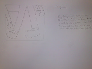
The above is the in class activity I've missed but I've done it at home. I chose footsteps because it is representative of our daily university lives. Time is precious and fast pace movement from venue to venue is common everyday.
1.

2. 

3. 

4. 

5. 

6. 

7. 

8. 

9. 

10. 

The story goes:
1. Jack was walking alone along a corridor at night. The picture looks as if it had 'defied' the rule of thirds because by right the "space" should be in front of where he is facing. I did that on purpose because I want audience to focus on him, then the empty corridor which shows that he is indeed alone. The lines on the pillars also made the corridor look long and straight.
2. Jack was followed by a stranger. I took the picture from the backview because I wanted audience to perceive "Jack as being followed behind" and yet hiding the face of the stalker. In the tutorial, an extremely good idea from one of the stories struck me and could be a better alternative to show "being followed". That is to show the feet at one corner while Jack is in front. In that way, the mystery of the stranger is better concealed.
3. Jack look behind but saw nobody. Once again, the focus is on the empty, long corridor. Another way to show that is to take the picture behind him and some distance away. In that way, I can show his face (and expression) looking along the corridor while still showing the long stretch of corridor. However, my friend isn't good at acting, so I decided not to show his face and yet achieve "looking behind and saw nobody."
4. Jack picks up speed. I purposely show only the feet as the feet is the only element of the whole human body that can demonstrate "running and gaining speed". The motion blur/trail was done on purpose too to make the picture "speak". Audience will get a sense of motion (or fast motion) by looking at the picture.
5. The stranger picks up speed. This picture was linked to the previous. This is because by showing a pair of feet and picking up speed first, the second feet must belong to the stranger.
6. Jack is in running speed and tried to look behind. I inserted this photo because I want to achieve continuity to the next picture, which is tripping and falling. In this picture, I want to show that Jack is running very fast and at the instance of looking behind. This can link well because he wouldn't have seen the can when he had looked behind. I used motion blur on his hands to show the speed of running
7. Jack tripped on the can and fell. Once again, I used motion blur to show him tripping on one foot. Without the blur, it would look as if he's just stepping on it.
8. Jack fell flat to the ground and a hand tapped on his shoulder. I personally didn't like this picture. I'm going to find a way to replace this. What I want to show is that he fell flat to the ground and the climax came (I had to acknowledge my classmates for defending me on this picture) when the stranger is about to "catch up on Jack and do something bad to him". The following pictures is going to be "bad" as the previous pictures are portraying a bad event that is going to happen to Jack.
9. The stranger handed a wallet to Jack. This immediately broke the climax and that the guy is a good guy trying to return Jack his wallet. I wanted to stop here and end the story. However, I feel that the ending is quite common. Returning wallet, items, etc. Therefore, I added another picture...
10. This picture tells a thousand words (not so exaggerating actually...). A frustrated expression on Jack with him inverting his wallet and trying to locate his money on the left while on the right (and behind), the stranger trying to run away (motion blur again). A single picture telling everything to end the story. By looking at Jack and his pose, audience will find something is wrong. This will lead the audience to seeing the stranger on the right, who is running away. Immediately, the ending is formed.
Applying most of the concepts learnt in class, I do have something to contribute. I realized that "depth of field" was not included. Depth of field enables audience to focus on the object that you want them to focus by blurring everything (usually not important) behind (usually far away objects). You would see this very often on movies (shot using 35mm lens), drama or professional photography. The only sad thing is that I didn't managed to get hold of a Digital SLR (single lens reflex) camera. I would probably make some of my objects blurer so that the focus is on my intended objects (Jack and the stranger).
The discussion and commets given by my classmates in class were quite unclear. There are people who criticized and there are people who defended the critiques for me (thank you!). However, I would like to improve further. So please comment if you have any idea on improvement. Thanks!
Tuesday, September 11, 2007
Assignment 2 - A breeze one
We're supposed to choose an object or activity and abstract it to a simple design. I had quite a number of ideas on this. The final idea that I chose was the simplest one which I had thought of when I was in the library. I saw some of the signs and it does not have one that is really "representative" of keeping "silence in the library". Lets look at my design:

The picture speaks for itself. It starts by reducing details step by step. The best picture is the 4th from the left where it contains a book, lips and pointing finger. Picture 5 is perfect for "Silence" or "keep quiet". I feel that it is too general to use it in the library. Picture 5 could be used inside/outside exam halls, library, inside theatre, etc. Therefore, in order to describe "silence in the library", picture 4 is the best. The sign itself can tell that it involves "books" and "silence". The place with the most books is the library. (probably won't need the sign for a bookshop in case you're arguing).
I was surprised when someone could guess the actual meaning of the icon by just showing the 5th picture. I was expecting the answer to be "Silence" instead of "Silence in the library". Looks like someone can guess what I am thinking... hmms... Anyway, the feedback given during the tutorial class is that the lips is not obvious. I think it is because of the "line" dividing the 2 lips isn't obvious from far. As seen in this picture, it is also not clear. I shall make it more obvious by thickening the line.
I heard that next week's tutorial is telling stories using pictures. I am looking forward to it as it is quite similar to filming which is one of my favorite hobby. Shall elaborate more about the concept for the next tutorial post. (Hint: storyboard is basically what you need to handle the next tutorial)
Completed Assignment 1!
This post is a delayed one because I didn't have time to update. Anyway I completed the digital conversion of my drawing and here it is.

This is the "destroy art" design for "I Hate Art". After the critic session, I do realized its too colorful. Colorful tend to bring a feeling of being "happy" and "enjoyment" which obviously is contrast to what I want to bring out. I have an idea that can retain the "colorful" and yet bring out the idea of "hate". That is "Messy Colorful". Let's see what I can do to make the final change then.

This is the design for fishing. I don't really like the design and will probably make a change. The feedback that was given is that the anchor doesn't seem to be part of "fishing" and that the "d" (a man holding fishing rod) isn't obvious. In conclusion, it means a major overhaul of both designs.
Sunday, September 2, 2007
Halfway through Assignment 1 last phase
Well, after the feedback, I've managed to discard my "mouse" design and modify my "paint brush" design to a newer one (and with color too!). I'm only left with the conversion to digital form.

I've changed my "like" as I thought computers are difficult to draw. I don't want to force myself to think and draw and end up computers being a "dislike" for me. Now, I've used one of my old likings, fishing, as an idea. And as for the "hate art" design, I've made it looked more "violent" as everything breaks and spills all over the place. I wished I could do that right now to my drawing tools but I still need them till end of semester. So I'll just count down 10 more weeks till "art tools breaking day".
I've changed my "like" as I thought computers are difficult to draw. I don't want to force myself to think and draw and end up computers being a "dislike" for me. Now, I've used one of my old likings, fishing, as an idea. And as for the "hate art" design, I've made it looked more "violent" as everything breaks and spills all over the place. I wished I could do that right now to my drawing tools but I still need them till end of semester. So I'll just count down 10 more weeks till "art tools breaking day".
NM2208 Week 3 - Criticism!
Been through the tutorial this week and the feedback is kinda devastating. I spent 6 hours drawing my 1st assignment. The feedback given for the "like" was: "Not good enough. Mouse cannot tell I like computers." Well, I was thinking how to represent my name using computers.
 Perhaps I wasn't imaginative enough and the following is my thumbnails. As you can see, they are plain simple. It could be because I hate art since secondary school. However, I am trying to savage whatever art "skill" that was left after 10 years of depreciation.
 Next is the "hate", the feedback received was far better than the first. At least people can tell "I hate art" by looking at the broken brushes. However, the lecturer said that more "punch" could be given to the design. I certainly agree as I also felt that way. I really hate art to the max!!! Probably that would drive my motivation to make it outstanding.
 I find the critique sharing session quite useful as it allows me to see ideas coming from various angles. I like the "Batman" design as he really made the original logo evolved into his name. I also like the concept of "left behind" where he made half of his name separated and "left behind". This kind of idea exposure is what an outstanding designer need to inspire himself.
Sunday, August 26, 2007
NM2208 Week 2
Wow! Finally finished creating the blog for NM2208 module 2007/2008. Assignment 1 supposed to sketch 8 thumbnails of a typography of my name based on my loves/hates. I kinda suck in drawing and art. Let's hope I can do something... (Oh btw, its $50+ worth of items in the picture...)

Subscribe to:
Posts (Atom)