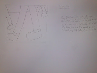
The above is the in class activity I've missed but I've done it at home. I chose footsteps because it is representative of our daily university lives. Time is precious and fast pace movement from venue to venue is common everyday.
1.

2. 

3. 

4. 

5. 

6. 

7. 

8. 

9. 

10. 

The story goes:
1. Jack was walking alone along a corridor at night. The picture looks as if it had 'defied' the rule of thirds because by right the "space" should be in front of where he is facing. I did that on purpose because I want audience to focus on him, then the empty corridor which shows that he is indeed alone. The lines on the pillars also made the corridor look long and straight.
2. Jack was followed by a stranger. I took the picture from the backview because I wanted audience to perceive "Jack as being followed behind" and yet hiding the face of the stalker. In the tutorial, an extremely good idea from one of the stories struck me and could be a better alternative to show "being followed". That is to show the feet at one corner while Jack is in front. In that way, the mystery of the stranger is better concealed.
3. Jack look behind but saw nobody. Once again, the focus is on the empty, long corridor. Another way to show that is to take the picture behind him and some distance away. In that way, I can show his face (and expression) looking along the corridor while still showing the long stretch of corridor. However, my friend isn't good at acting, so I decided not to show his face and yet achieve "looking behind and saw nobody."
4. Jack picks up speed. I purposely show only the feet as the feet is the only element of the whole human body that can demonstrate "running and gaining speed". The motion blur/trail was done on purpose too to make the picture "speak". Audience will get a sense of motion (or fast motion) by looking at the picture.
5. The stranger picks up speed. This picture was linked to the previous. This is because by showing a pair of feet and picking up speed first, the second feet must belong to the stranger.
6. Jack is in running speed and tried to look behind. I inserted this photo because I want to achieve continuity to the next picture, which is tripping and falling. In this picture, I want to show that Jack is running very fast and at the instance of looking behind. This can link well because he wouldn't have seen the can when he had looked behind. I used motion blur on his hands to show the speed of running
7. Jack tripped on the can and fell. Once again, I used motion blur to show him tripping on one foot. Without the blur, it would look as if he's just stepping on it.
8. Jack fell flat to the ground and a hand tapped on his shoulder. I personally didn't like this picture. I'm going to find a way to replace this. What I want to show is that he fell flat to the ground and the climax came (I had to acknowledge my classmates for defending me on this picture) when the stranger is about to "catch up on Jack and do something bad to him". The following pictures is going to be "bad" as the previous pictures are portraying a bad event that is going to happen to Jack.
9. The stranger handed a wallet to Jack. This immediately broke the climax and that the guy is a good guy trying to return Jack his wallet. I wanted to stop here and end the story. However, I feel that the ending is quite common. Returning wallet, items, etc. Therefore, I added another picture...
10. This picture tells a thousand words (not so exaggerating actually...). A frustrated expression on Jack with him inverting his wallet and trying to locate his money on the left while on the right (and behind), the stranger trying to run away (motion blur again). A single picture telling everything to end the story. By looking at Jack and his pose, audience will find something is wrong. This will lead the audience to seeing the stranger on the right, who is running away. Immediately, the ending is formed.
Applying most of the concepts learnt in class, I do have something to contribute. I realized that "depth of field" was not included. Depth of field enables audience to focus on the object that you want them to focus by blurring everything (usually not important) behind (usually far away objects). You would see this very often on movies (shot using 35mm lens), drama or professional photography. The only sad thing is that I didn't managed to get hold of a Digital SLR (single lens reflex) camera. I would probably make some of my objects blurer so that the focus is on my intended objects (Jack and the stranger).
The discussion and commets given by my classmates in class were quite unclear. There are people who criticized and there are people who defended the critiques for me (thank you!). However, I would like to improve further. So please comment if you have any idea on improvement. Thanks!


 Perhaps I wasn't imaginative enough and the following is my thumbnails. As you can see, they are plain simple. It could be because I hate art since secondary school. However, I am trying to savage whatever art "skill" that was left after 10 years of depreciation.
 Next is the "hate", the feedback received was far better than the first. At least people can tell "I hate art" by looking at the broken brushes. However, the lecturer said that more "punch" could be given to the design. I certainly agree as I also felt that way. I really hate art to the max!!! Probably that would drive my motivation to make it outstanding.
 I find the critique sharing session quite useful as it allows me to see ideas coming from various angles. I like the "Batman" design as he really made the original logo evolved into his name. I also like the concept of "left behind" where he made half of his name separated and "left behind". This kind of idea exposure is what an outstanding designer need to inspire himself.